
Year In Review Case Study
During the Fall 2024 semester, I was given the opportunity to conduct an in-depth case study of Vanguard’s Year in Review interface through my MEJO 581: User Experience Design and Usability course. I dedicated myself to conducting user research, developing personas and learning from Vanguard professionals to create a stronger digital experience.
Vanguard is one of the largest investment management companies in the world. At the end of every calendar year, the company offers a “Year in Review” feature to show users how their investments have transformed over the past twelve months. My goal was to redesign this experience with an audience of investors over the age of 50 in mind, doing so in a way that simplifies complicated financial terms, provides additional support throughout the navigation process and helps users contextualize their finances in terms of retirement goals.
Project Goals:
Accessibility:
Ensure Vanguard’s Year in Review interface is accessible and intuitive for users over the age of 50 who may have different goals in mind for their futures and different priorities in web interfaces.
Information:
Add or edit content in Vanguard’s Year in Review to better suit the investment needs of users over the age of 50, ensuring they can visualize how annual finances impact future goals.
Aesthetics:
Create an updated Year in Review that seamlessly meshes with Vanguard’s established branding while remaining visually appealing to users by incorporating graphics, visuals and text copy.
Usability Testing:
Four of my classmates and I conducted a series of usability tests with potential users to get a better grasp as to what does and doesn’t work with the current YIR.
Our goal was to use these tests as a way to inform ourselves as to what people over 50 years of age retain and understand from Vanguard’s feature, so that we were able to design stronger interfaces and build personas based on these findings.
Methodology:
The testing and listening sessions were conducted over Zoom. Our session progressed in a few steps:
Listening Session: We began by asking users to tell stories around their financial experiences.
Pre-test survey: Users then answered specific questions about their prior investing experience and software preferences.
Free exploration: Users explored the YIR interface at their own pace.
Core tasks: Users explained how they navigate the YIR as well as sharing comprehension of the charts and numbers being featured.
Post-test survey: We asked a few follow-up questions about what each user would change and how they used the software.
Participant Ages:
Limitations:
As with any user test, we ran into some limitations as to what was feasible:
Environment: Each of us conducted our usability tests in different environments. Our users were also testing from areas they were comfortable in, such as homes or personal offices.
Technology: Some subjects had difficulty operating the Zoom software, leading to technical difficulties during the testing process.
Time: Our interviews were constrained to 45 minutes. A longer session may have opened avenues to deeper discussions, but we had to focus on streamlined user tests.
Each limitation was kept in mind as we progressed.
Gender Breakdown:
Positive Findings:
Layout: Each page had a clear visual hierarchy for users to follow and comprehend.
Visualizations: Data visualizations were easy to read and supplemented necessary information for visual learners.
Tone: The copy on each page had an education but accessible feel to it that users appreciated.
Interest in Continued Use:
Negative Findings:
Navigation: Some navigation paths, such as exiting the process or finding specific next steps, were met with confusion.
Labeling: Some financial terms were labeled but others weren’t, giving users a sense of confusion and inadequacy.
Missing Features: Users repeatedly voiced desires for stronger summary overviews, more relevant projections, and advisor contact options.
Audience Analysis:
After conducting usability tests, my classmates and I created an audience analysis chart to build upon our results while pulling in external sources to better reflect our user demographics.
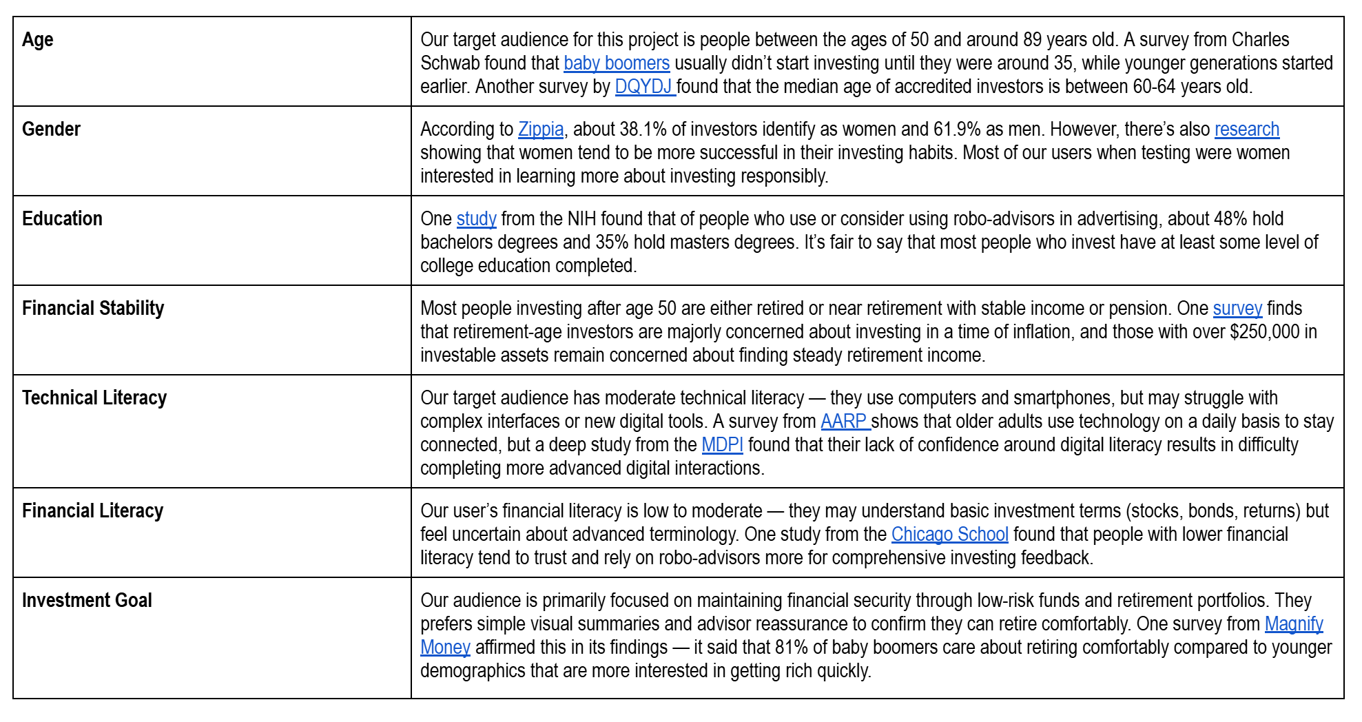
This shows us…
Our users’ average age is around 60-64 years old, with most beginning to invest in their 30s.
Unlike our usability test, most of our users identify as men, but those that are women tend to be more interested in investing responsibly.
Our target audience has moderate technical literacy. Although they may easily text and call, they struggle to ask for help when faced with technical confusion points.
The biggest goal for our target audience is to retire comfortably, not to get rich quickly. They want to continue projecting toward their goals.
Persona Construction:
After analyzing our audience, it was time to develop behavioral personas. We started by creating three basic personas:
Persona 1: “This persona has an entry-level of knowledge, often describing themselves as a "layperson" whose brain "shuts down" when faced with "core finances" language. Their philosophy centers on finding simple, safe ways to start investing, believing that investment can be something small, not just something big. Because they lack experience, they are highly motivated by clarity and a fear of "fine print," wanting all important information right up front.”
Persona 2: “This person has a moderate level of financial knowledge, they are not novices but consider themselves "not knowledgeable at all at all time" with a preference for risk-averse strategies. Their core philosophy is about preserving wealth and avoiding loss, leading to a focus on stability. They are motivated by concern over market volatility, political climate effects, and social responsibility, which influences their investment choices. They typically only check their portfolio about once a quarter when statements arrive, as checking daily would make them a "nervous wreck". They rely heavily on human support, needing an advisor to help them understand and feel better about their decisions.”
Persona 3: “This persona has a more experienced or intermediate level of knowledge, and they check the account whenever they need. They are more comfortable using Vanguard tools for personal and retirement savings and often managing a variety of accounts. Their philosophy is one of active engagement; they see the interface as a platform to explore, strategize, and self-service. They are motivated to ensure their portfolio matches their desired risk profile and love tools that allow them to categorize themselves (e.g., "high risk investor or medium risk investor"). They also enjoy reviewing a fund's entire history (going back 15 years) to understand its average performance.”
Then, it was time for me to flesh one out. Meet Vann.
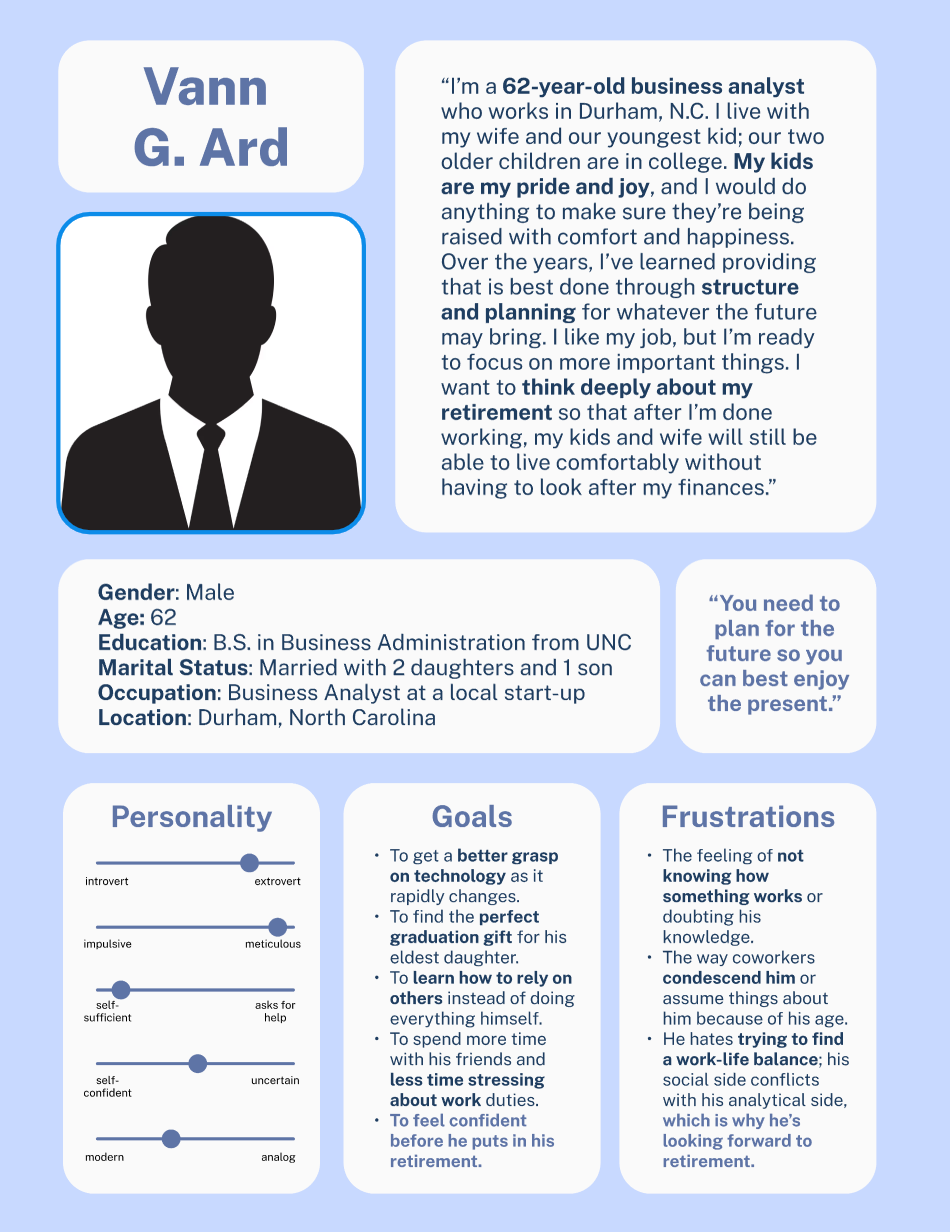
Since our audience demographic research showed that most users of this interface would have some level of investment experience, even if it came through a robo-advisor and not directly, I wanted to develop the third persona to create a believable user.
Vann G. Ard is a 62-year-old father of two who resides in Durham, North Carolina. He works as a business analysist, and although he’s nearing retirement age, I wanted him to feel full of energy. Although Vann’s face is not pictured to avoid any racial or gender bias, he has a clear personality and various goals, the biggest of which is to retire comfortably.
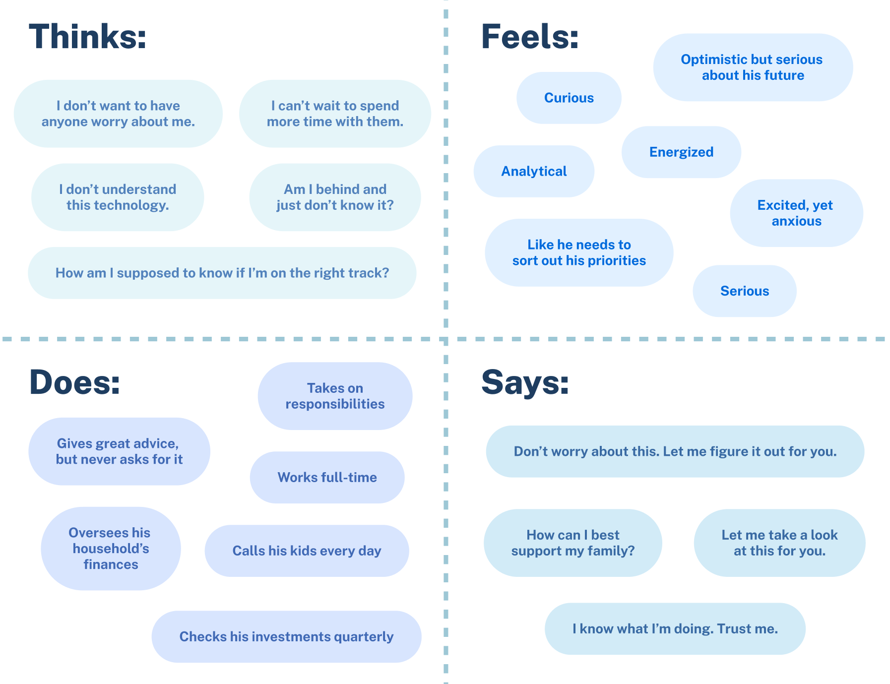
Vann’s persona poster and accompanying empathy map focuses on his personal discomfort in asking for help, his desire to take care of the people around him, and his passion for preparing for retirement as to better enjoy his time with the people around him. Creating him allowed me to think more critically about who I’m designing for and how to best meet their needs.
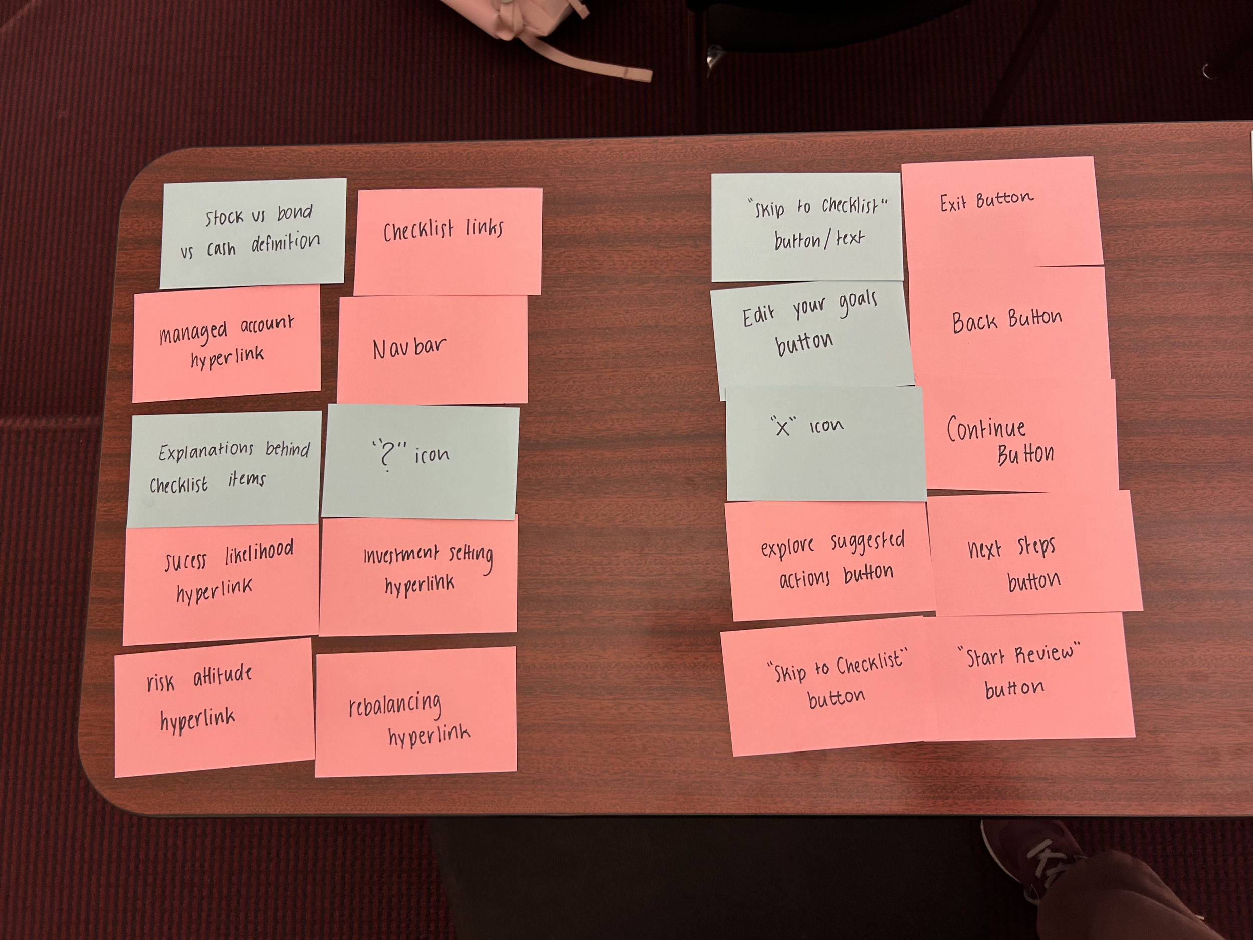
Structures and Sorts:
In card-sorting, I aimed to list and divide as many elements I could recognize on the Vanguard YIR interface, as well as elements I thought the YIR was missing.
I came up with nearly 70 cards, including some of the following:
UX Elements:
? icon
X icon
Continue button
Back button
Exit button
Bold text
Paragraph text
‘V’ Vanguard logo
Full Vanguard logo
Checklist card
Lightbulb icon
Checkmark icon
Line dividers
Bullet points
Welcome messages:
Welcome message (copy)
Start review (button)
Skip to checklist (button)
Blocky introduction (illustration)
What is this (hyperlink)
Balances:
Balance increase (header)
Balance increase (copy)
Managed account definition (hyperlink)
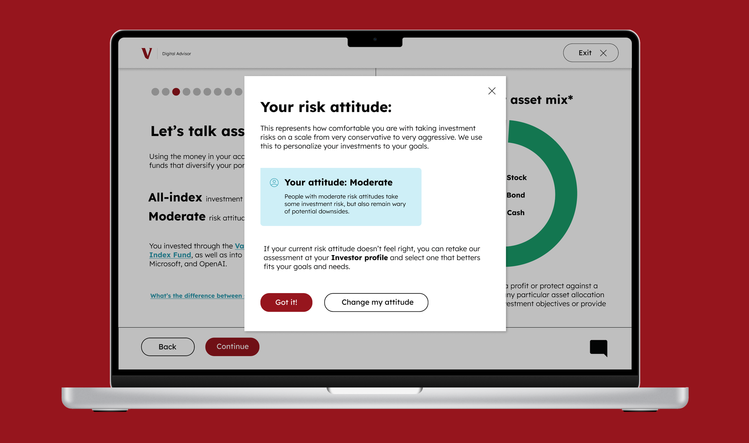
Risk attitude definition (hyperlink)
Balance comparison (bar graph)
Asset mix:
Your assets (header)
Asset mix (copy)
Asset Mix (pie chart)
Stock vs bond vs cash definition (hyperlink)
Checklist:
Checklist (header)
Consider this year… (copy)
To-do checklist items (copy, hyperlinks)
Next Steps (button)
Checklist graphic (illustration)
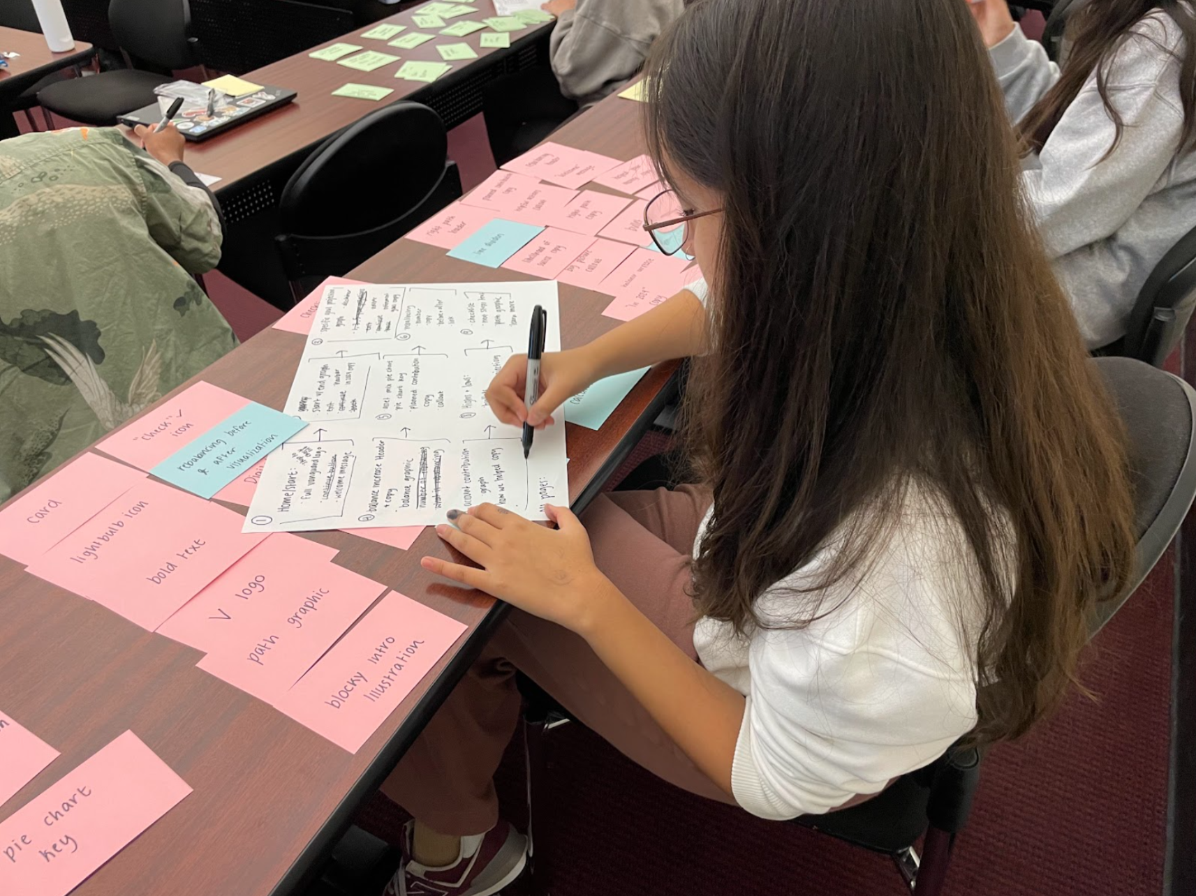
User Flow Construction:
After sorting my cards into more specific screen-by-screen groups, I created a flow diagram to translate into my wireframe.
My user flow is primarily linear, with a few ways to circle back and additional screens for further information. This was not a committed layout; it was a starting point to start thinking about what screens were most important to include and what layouts needed additional information not yet offered by Vanguard’s interface.
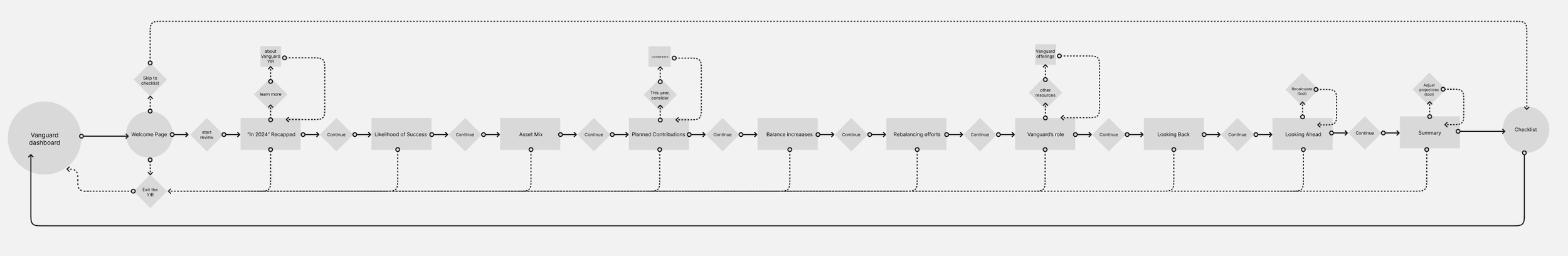
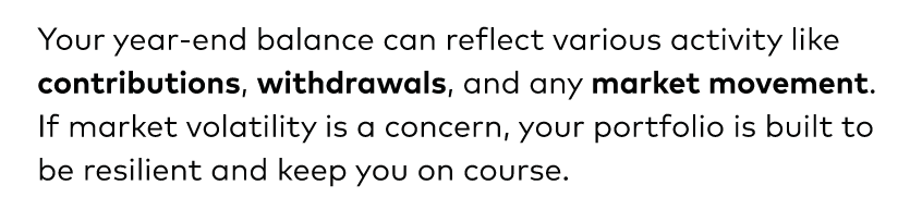
The flow builds on the established pattern of information in Vanguard’s current YIR, bit it adds additional callouts and pop-ups, interactive tools like a calculator, and more intentional data visualizations instead of generic graphics. It also includes new screens that re-summarize information, introduce new year-by-year projections, and emphasize Vanguard’s role in the users’ success. My hope is that this new flow would allow me a starting point to build something more intuitive and efficient for 50+ year old users.
Key Wireframes:
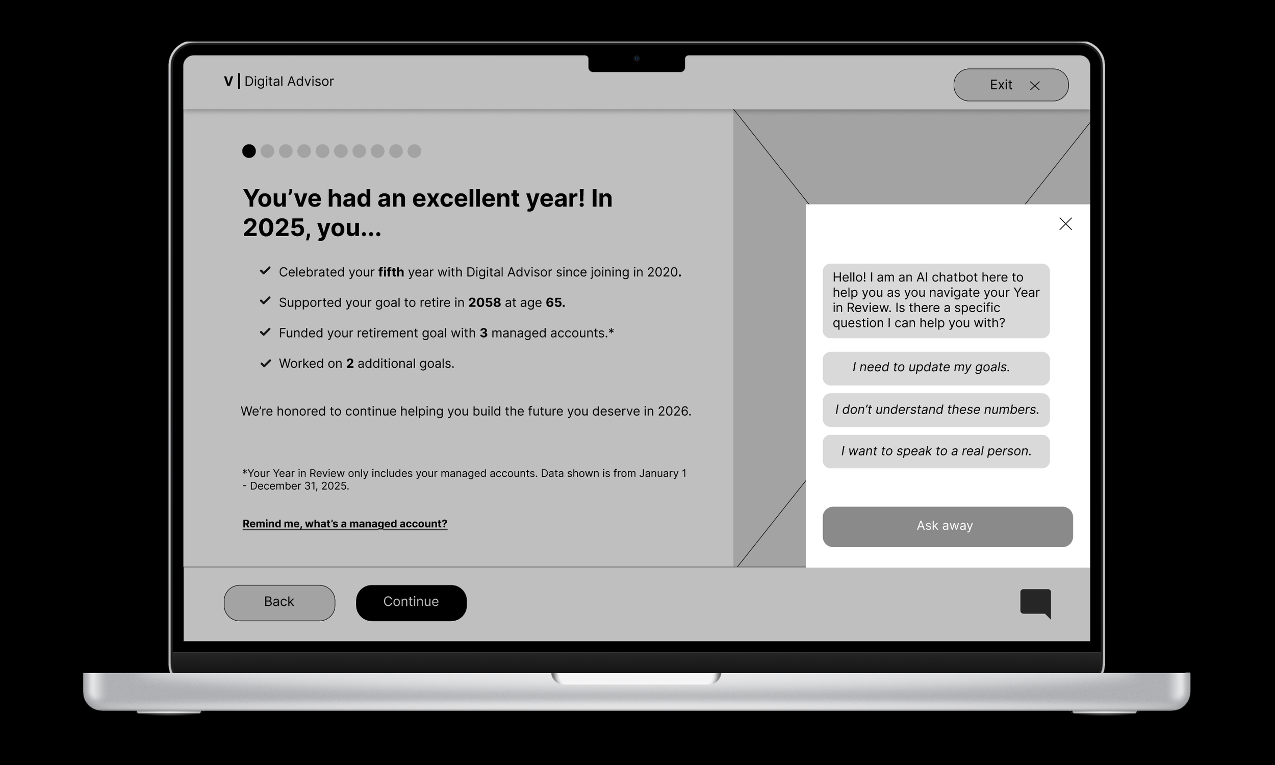
I created over 15 basic wireframes to construct my redesigned YIR interface. These wireframes were built in grayscale but fully prototyped to best translate into a final product.
There were some screens that weren’t significantly changed from the pre-existing YIR page, like the welcome page. However, I took liberty to adjust ratios, build new pop-ups and create new screens to give a better sense of what the user’s 2025 finances mean in a broader context about their investment history and retirement goals. I also implemented a new chat feature and replaced exit buttons to improve navigation and reduce confusion.
My wireframes only covered the YIR presentation itself, not the dashboard or following checklist.
Style Guide:
Style guides are one of my favorite parts of the design process, so I was eager to get mine right.
In this style guide, I focused on using the fonts, colors and assets that already appeared on the Vanguard Year in Review site — like the iconic red color and the style of the pop-up definitions — while expanding on aspects of the design that felt less intuitive, like the small exit button and intense blue ‘hyperlink’ style definition text. I also added a simple chat icon to hint at another new feature.
Each element was created with care so to streamline the final prototype construction. More detailed explanations behind design choices can be viewed on the Figma file embedded below:
High-Fidelity Mockups:
Finally, it was time to put everything together.
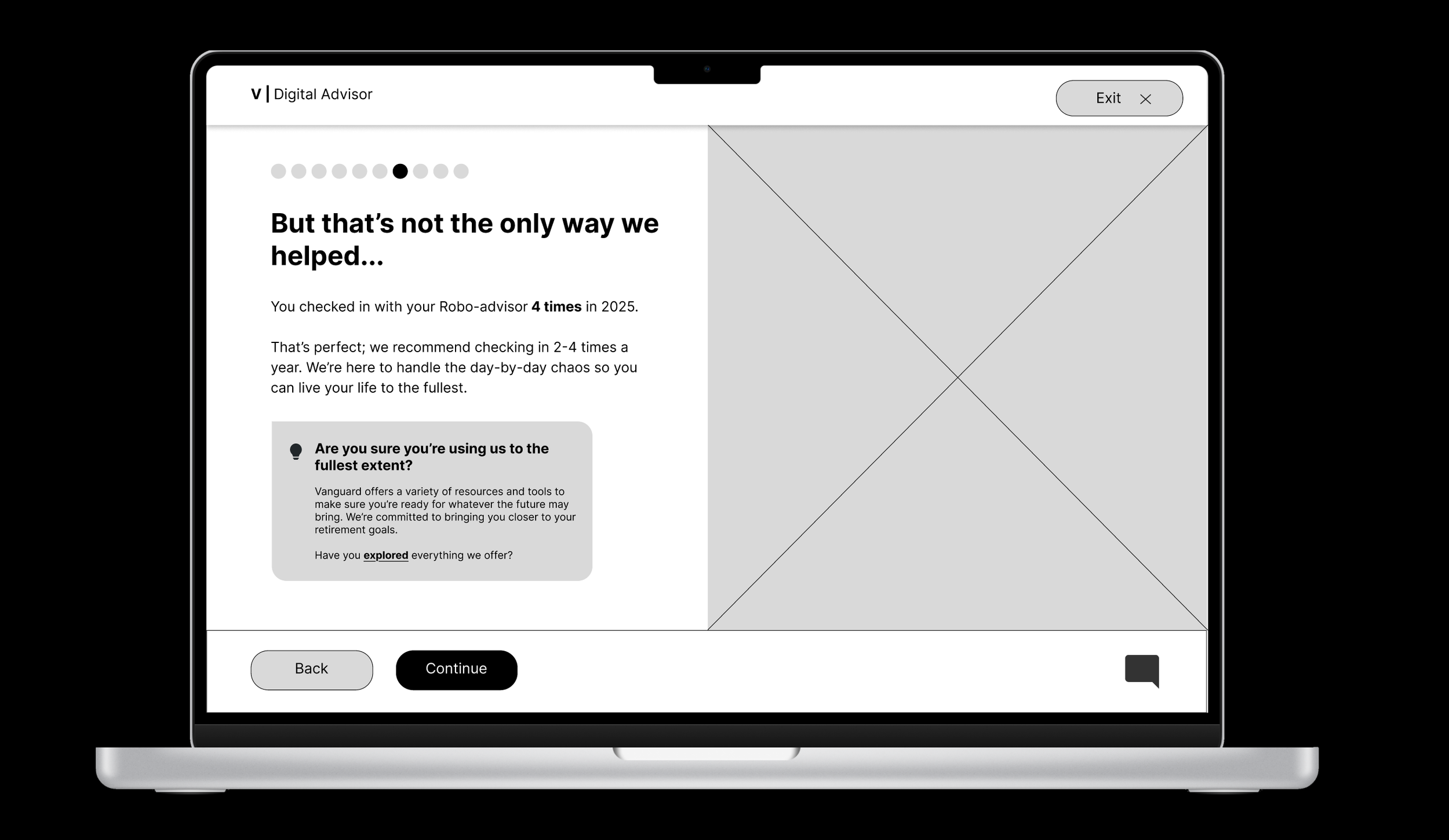
My high-fidelity mockup included 12 screens consisting of over 25 frames. Every detail was designed to fit the audience demographic I had been researching. My mockup included a few key changes:
Improved accessibility:
To address user concerns about navigation, I increased the size and coloring of the navbar in the top right corner.
I also increased the button sizes and redesigned the “Exit” button to match the two at the bottom while sitting at the top as to not take up unnecessary space.
I kept my fonts as similar to the original YIR interface as possible and bolded fonts for emphasis.
I made sure my backgrounds for my callout boxes met contrast accessibility recommendations.
Additional screens:
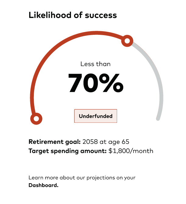
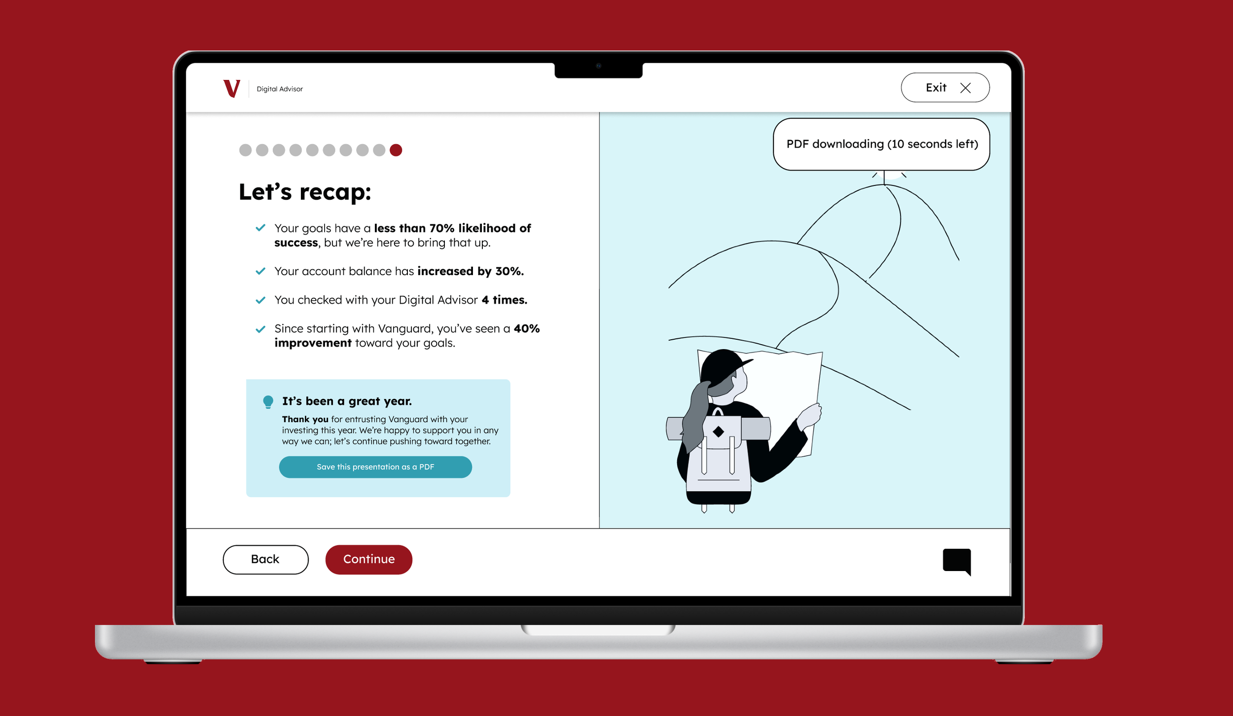
I reordered most of the original screens from the Year in Review to focus on recent numbers, then explain how Vanguard made those numbers a reality, and finally to contextualize those numbers in previous and upcoming years.
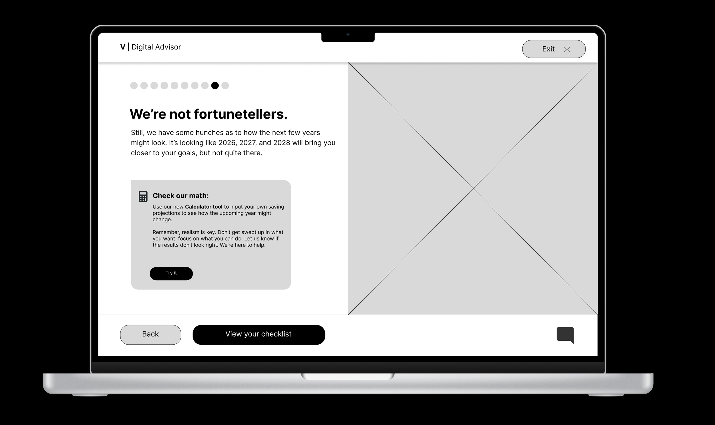
To do so, I introduced new “looking ahead” and “looking back” screens, as well as a redesigned “recap” screen.
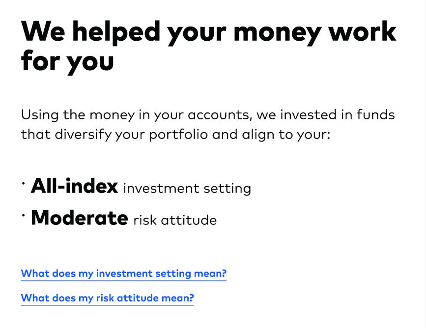
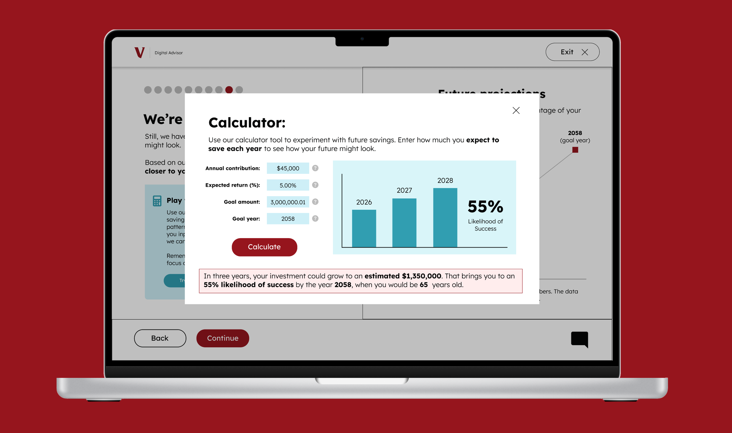
I developed new calculator tool and an AI chatbot to help users better understand where projections are coming from.
New data and terminology:
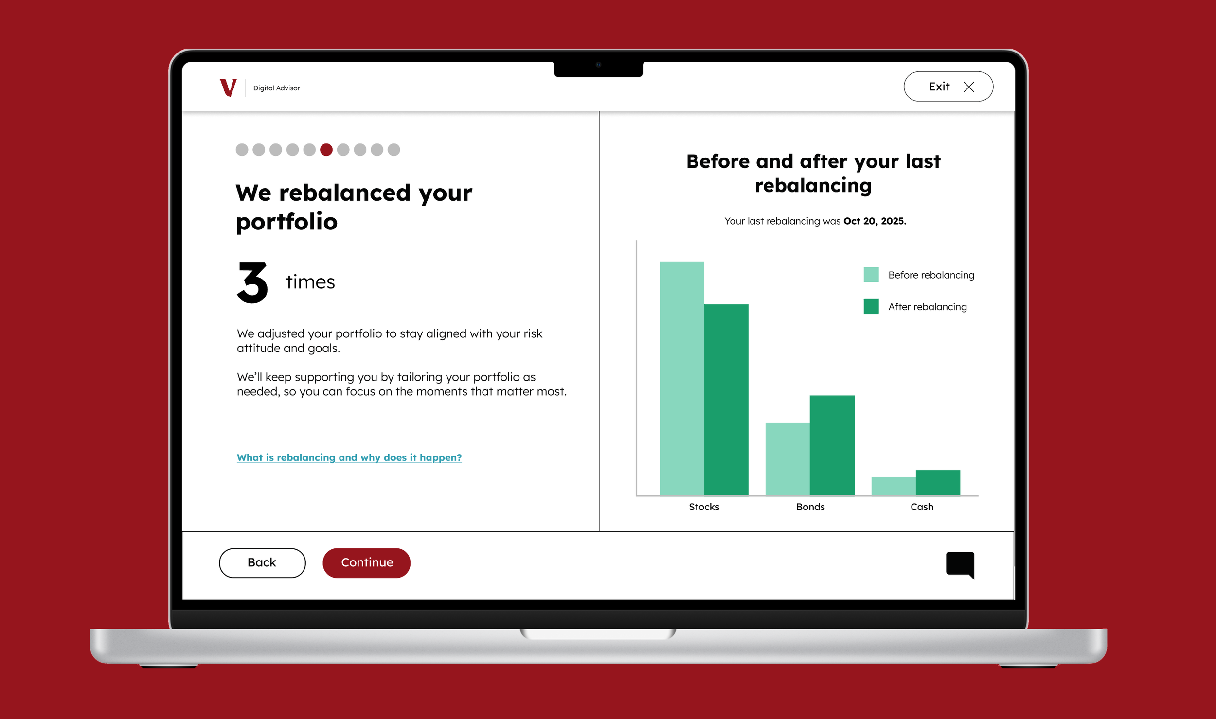
I redesigned data visualizations to keep the colors consistent while also making the most of the space on the screen.
I also created new data visualizations, including bar and line charts, to better assist visual learners in seeing how their goal progression is shifting.
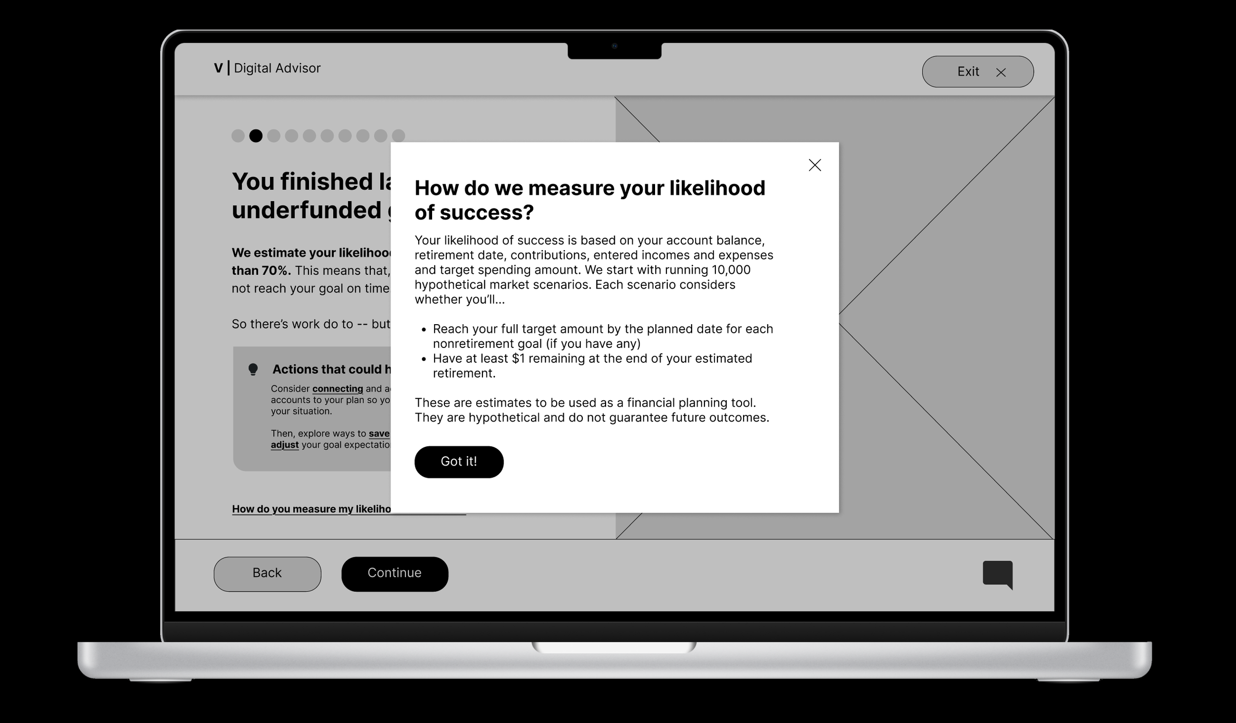
Additionally, I introduced various new terminology pop-ups to better explain terms like compound interest and rebalancing, as well as expand on questions users may have about Vanguards’ processes.
Concluding Notes:
I presented my work to Vanguard UX designers in December 2025.
My pitch presentation was accompanied with the short slide deck embedded below.
This project was an incredibly opportunity to delve into the world of UX design. I learned so much about user research and accessible user-friendly design, all skills which I hope to build upon in the future as I continue to explore visual design work. I’m incredibly grateful to Vanguard and to my professor, Laura Ruel, for giving me a chance to work on this project, and I’m excited to continue doing more pieces like this.